Finding the Right Way
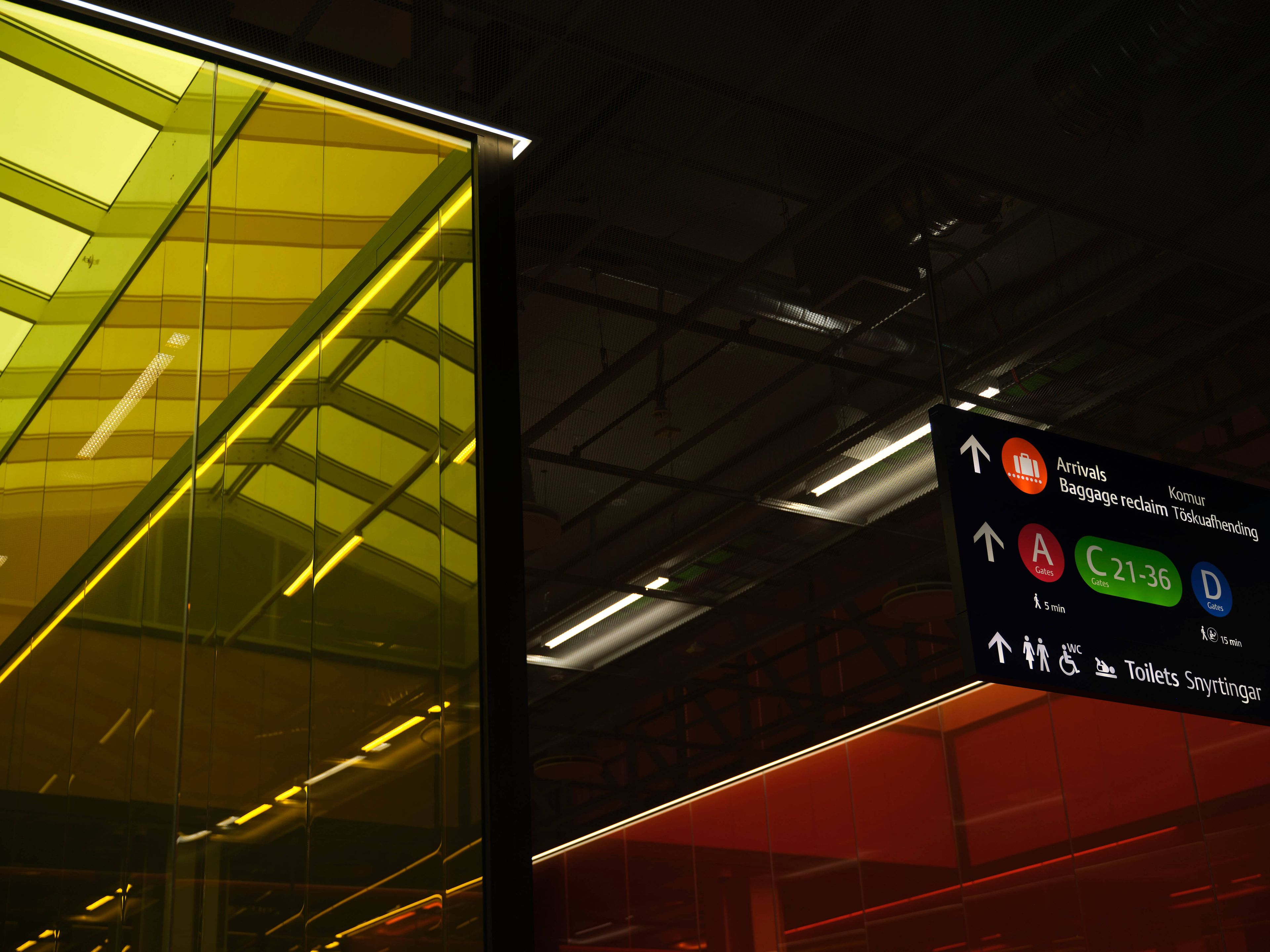
Wayfinding at an airport is far more than just signage. It is about how people navigate the space and make decisions along the way, and how we perceive, interpret, and orient ourselves in an environment where timing is critical. A clear wayfinding system simplifies flow, provides a sense of security, and reduces stress. With clear presentation of information, the journey becomes seamless and intuitive.
Today, there are over 200 signs in the terminal, comprising around 750 sign panels in 25 different sizes. The goal is to simplify this system and reduce the number of signs without compromising wayfinding, ensuring that passengers can find their way with ease.
Voice, Icons and Colours
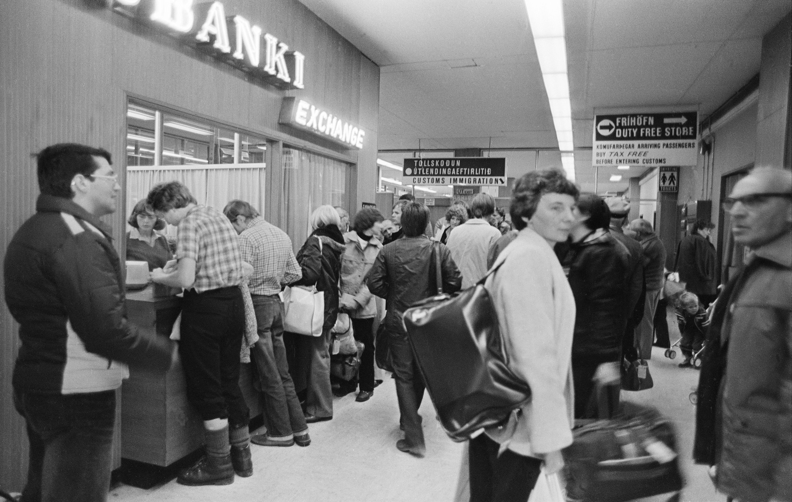
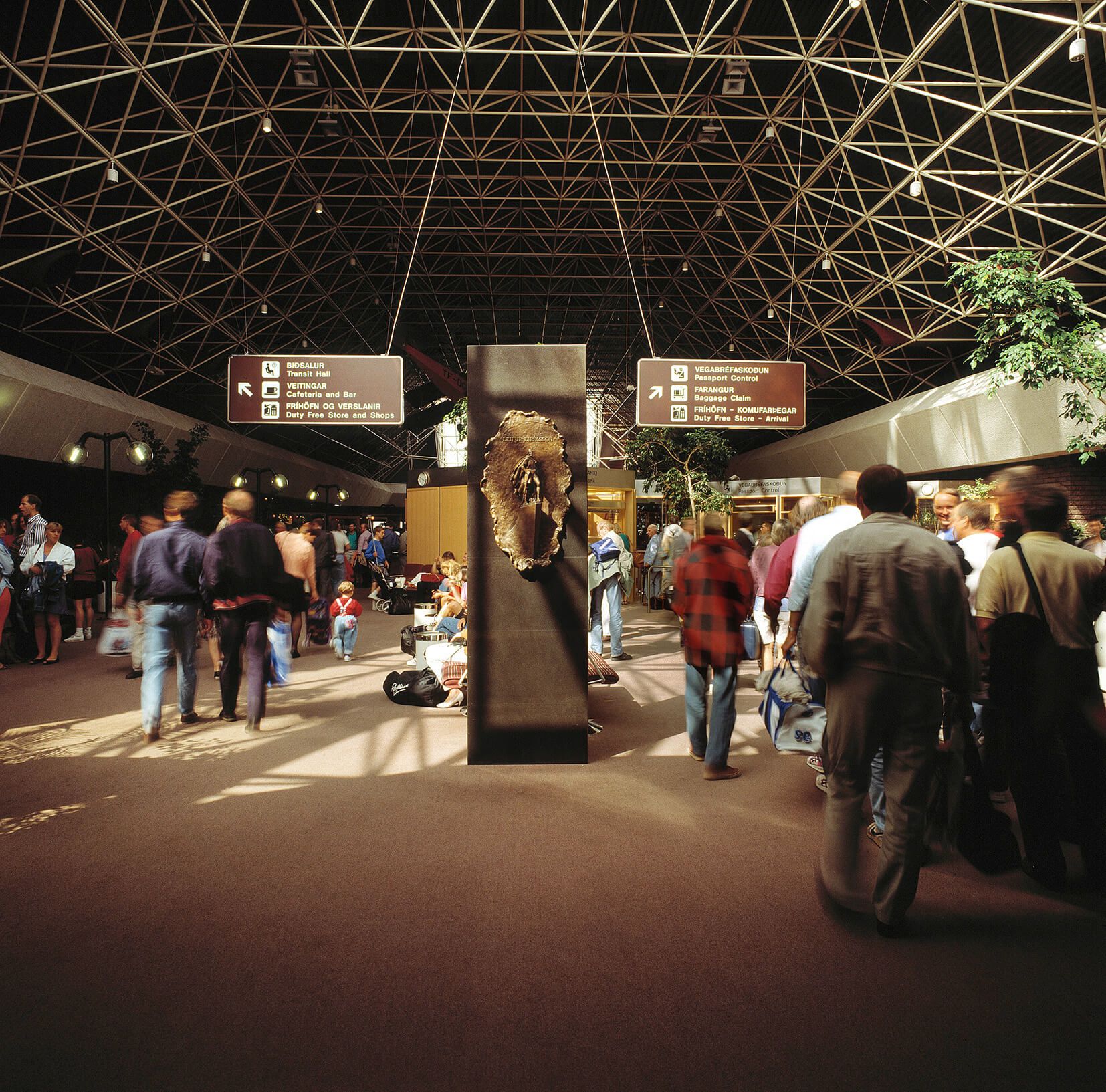
In KEF’s wayfinding system, Icelandic is the foundation, the voice of the place, and the connection to it, while English addresses international visitors. Words, however, are only part of a larger whole. Symbols, arrows, and alphanumeric characters form a coherent system that works across languages and cultures. This makes it easier for guests to find their way, both from a distance and in close proximity to the signage.
The typeface is clear, refined, and legible under varying conditions, in motion, at a distance, and in changing light. Font sizes, letter spacing, and colours are carefully calibrated based on the experience of the space itself. The type is not only used to convey text, but is an integral part of the overall experience.
The colour palette draws inspiration from the Icelandic landscape. A black background, inspired by lava, creates calm and reduces visual noise. White ensures clarity, while a gold tone adds warmth and distinction. Strong contrasts enhance legibility, particularly in the busy environment of the airport.
A Layered Whole in Continuous Development
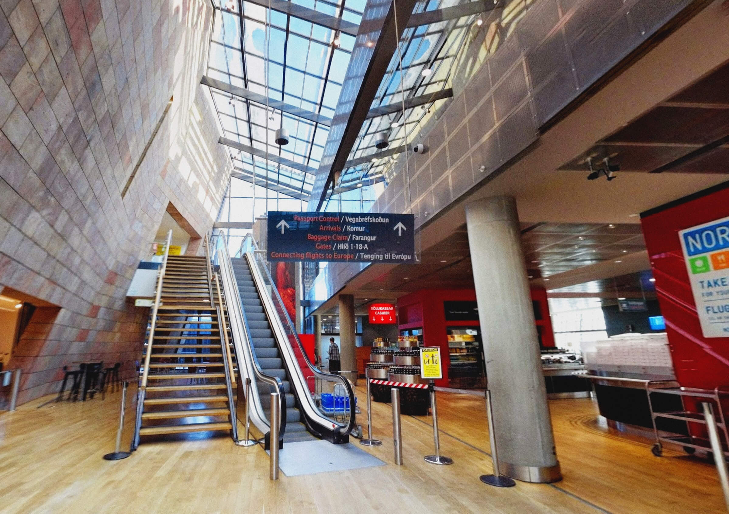
KEF’s wayfinding system is integrated with the architecture of the terminal. In a constantly growing airport, where there is a strong demand for a pleasant experience and seamless flow, everything must work together. The clear, structured visual identity must fit effortlessly into the space, where materials, colours, and signage guide passengers forward.
Extensive visibility testing has been carried out to ensure that information is clearly communicated under different conditions, both at a distance and in motion.
The process is in continuous development, with the experiences of passengers and staff shaping the solutions. The result is a clear and coherent system with strong focal points within the space. Everything is designed to improve flow, reduce uncertainty, and create a pleasant experience from arrival to departure.
Undir mynstrinu:
Patterns derived from KEF’s design system. The system is based on the fundamental forms of the square and the circle, and in its simplicity it evokes references to Iceland’s cultural heritage, such as Celtic symbolism, Icelandic woodcarving, and traditional craftsmanship.